When I started at Baar Products the company was already in the process of a website redesign; six months in we received the rough version of the site and began to testing for bugs and potential issues. We were a small team, three in total, and after a few weeks it was becoming difficult to maintain focus while testing.
With that in mind, and also considering that the website was intended for customers who weren’t in our demographic, I pitched the idea of a usability study to the owners. I would gather five users who fit into two persona types, test them using the rough site, and ask questions based on the testing, and use that information to examine the site for any issues we had missed.
Personas
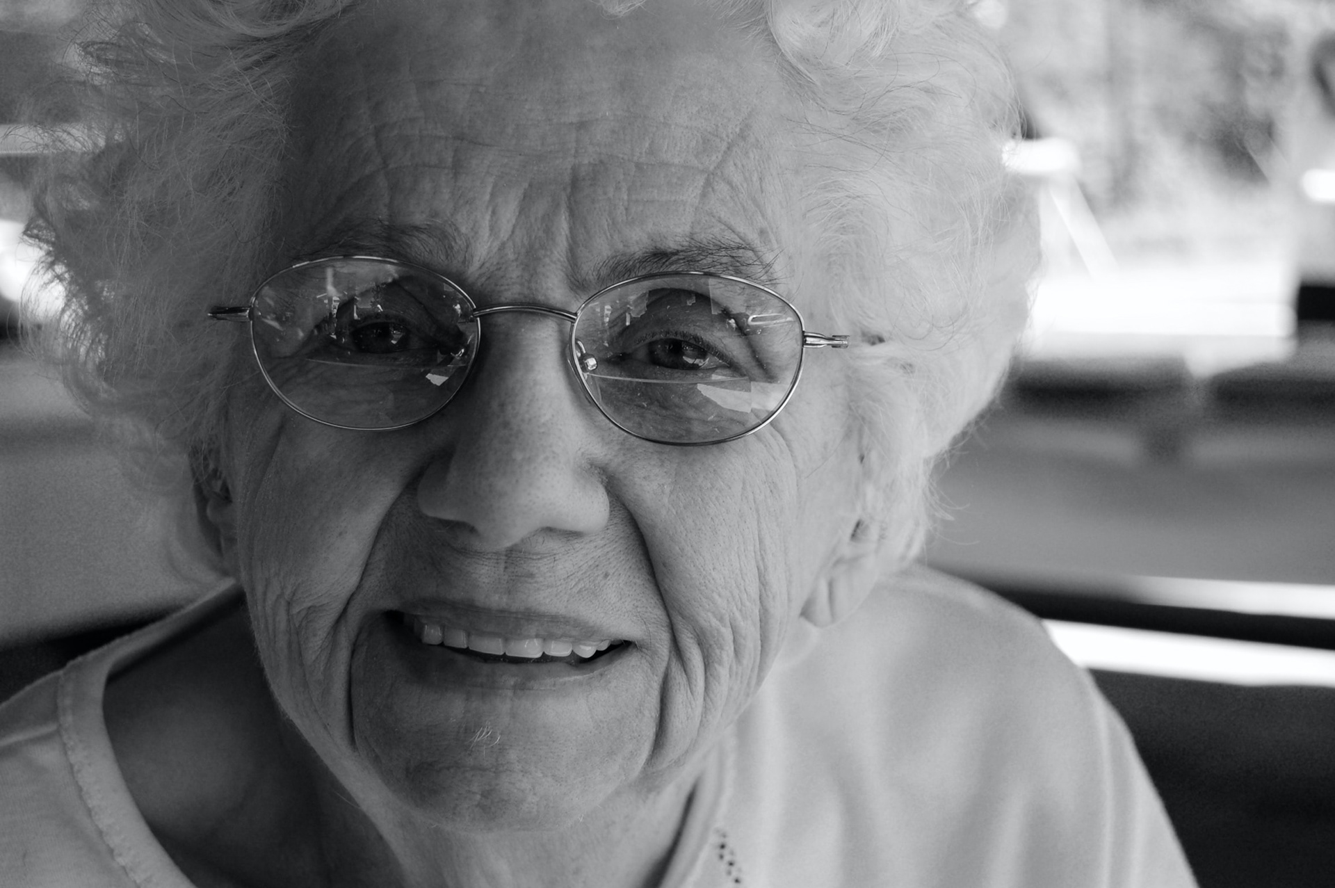
Persona #1
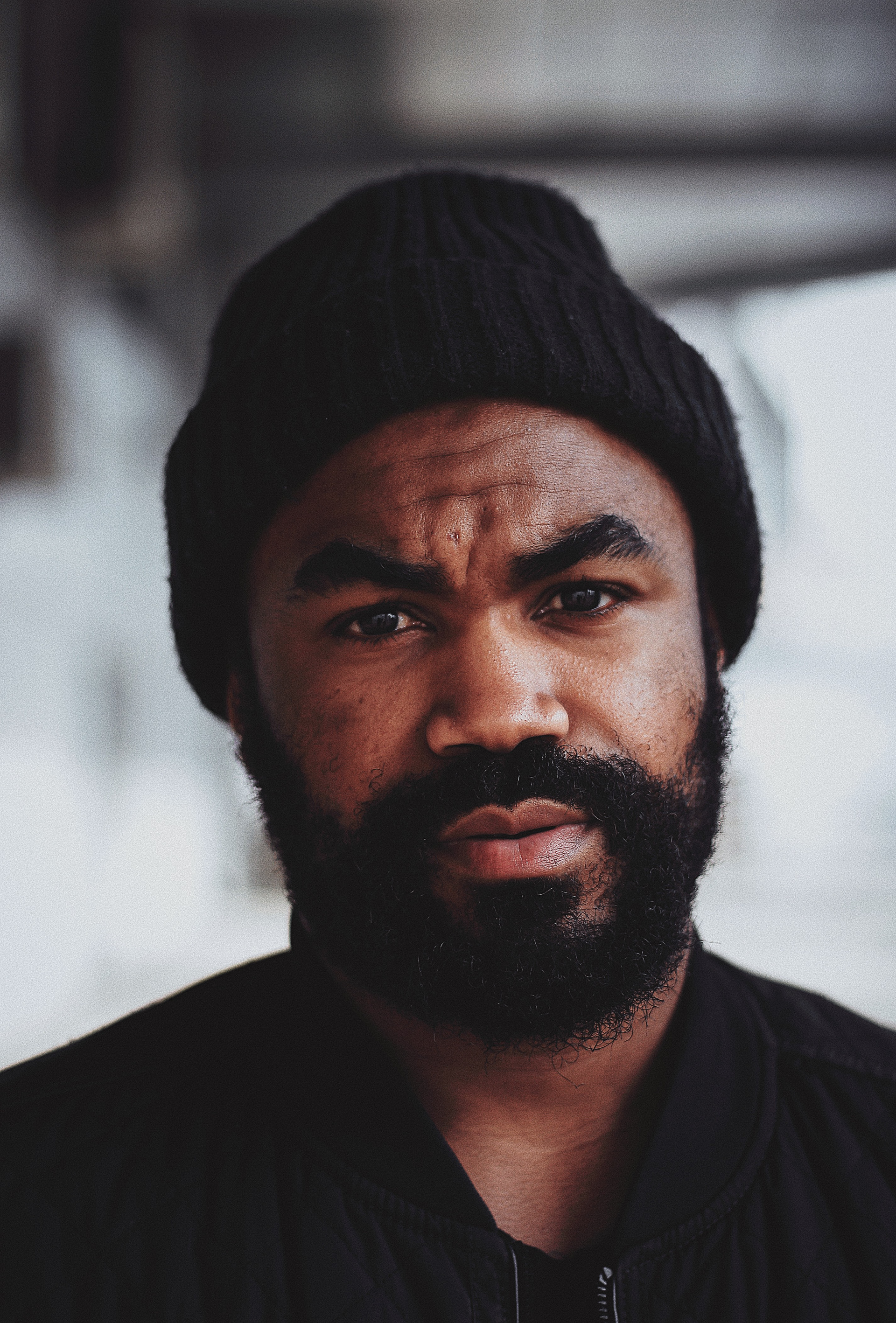
Persona #2
The first persona would be our traditional customer: caucasian women, forty-years-old and up, who ordered through our phone line or by mail. The second persona would be people of any age, race, or gender but preferably not of any of the three that match the first persona, who used our existing website to order from us. We would offer them a stipend for their time, and put them through a series of tests with an interview at the end with several pre-written questions and any questions that occurred during the testing. The questions would be split between quantitative and qualitative, my goal being to have actionable information and impressions of the site from users.
Usability Study Structure
I was given approval from the owners, under certain conditions, and moved forward with the study. I came up with three parts: for part one users would be free to explore the site for five minutes and while they explored I asked that they narrate their journey out loud. The second portion would be a timed exercise. An e-commerce site, the goal was in support of what the site was for, to find a particular product and take it to checkout. for part three I interviewed them with a series of prewritten questions, ten in total, as well as any questions specific to the particular user being tested.
Results
The information provided valuable immediate information to the owners about user impressions of the site, which were overall positive. It also highlighted several key issues that were considered problematic and would need to be addressed. With the information given I was able to implement a plan to address these issues based on the friction they would cause users. We found several issues, the primary issue being a problem with the search function that brought back erratic results and needed to be addressed immediately, and several smaller issues that ranged from slight impact on site usage to cosmetic issues that should be fixed but were deemed unimportant to the overall flow of the site. I’m especially proud of this work due to the fact that I made it happen; I saw that opportunity, pitched it, crafted it, ran it, and was able to gather information that benefitted the site.


