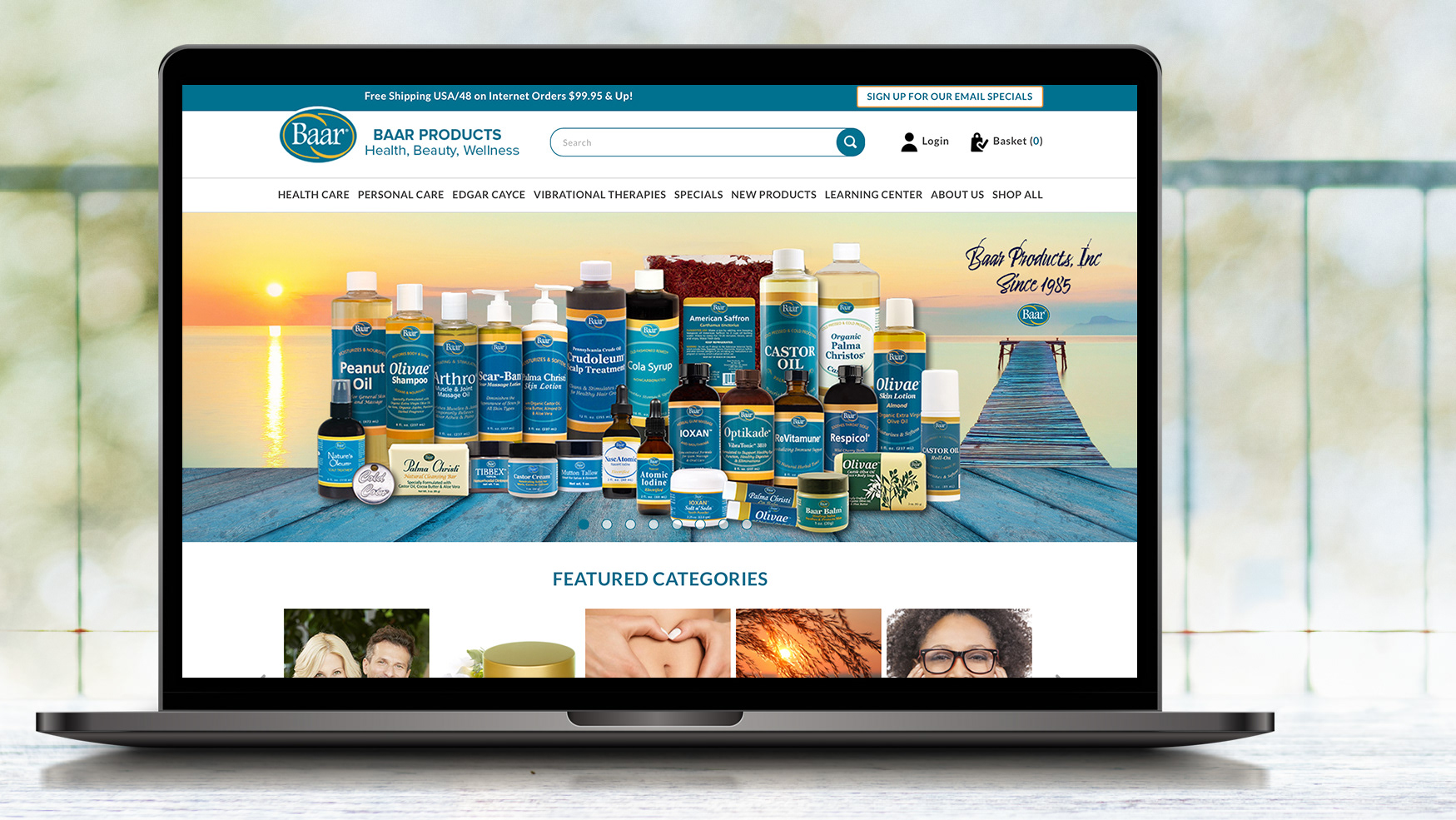
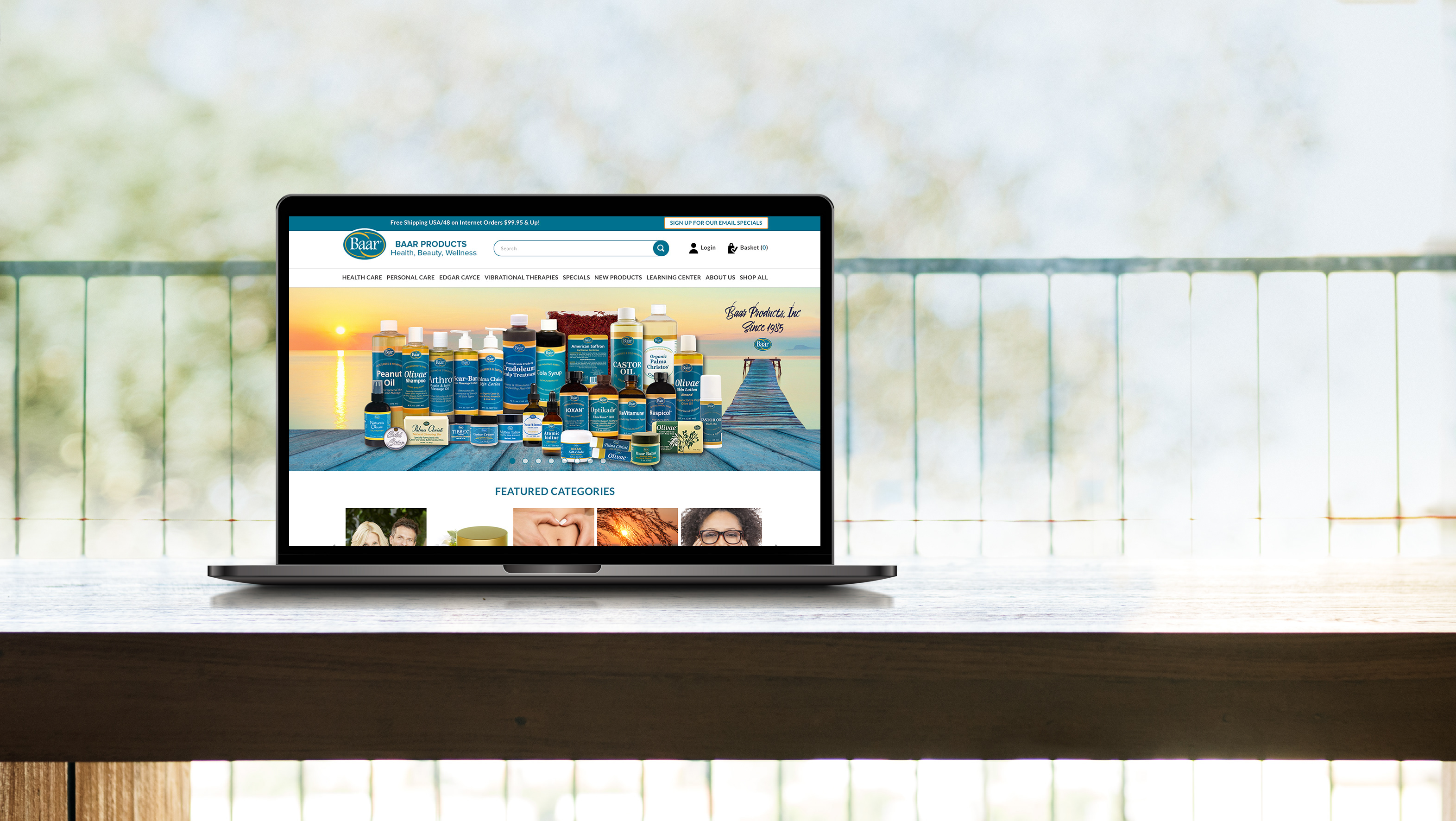
The company wished to add membership and tiered users to an already existing site. My goal was to create these pages and integrate them in a way that they didn't stand apart from the rest of the site visually and that the new pages would seamlessly interact with the site.
I created the Sitemap using Figjam, incorporating the new pages and content into the existing site. The goal was to integrate and have it connect to the existing work seamlessly.
These are the screens I designed for the project, as per the wishes of the stakeholders.
Prototype of the created pages, made for basic functionality so stakeholders to have an idea on movement through the site.
Home Page:
This page is designed to incorporate the existing site and the new content, this is what you would see upon signing in. We wanted to focus on selling the site itself, which would be done with the banner, then users would view the plan options. The goal is to expand content and introduce a tiered payment system, which was part of their plan to monetize the work.
About Page:
This page shows the team and provides a space for text.
Event Page:
These are the options presented to users for different events and activities in their area. A user who isn't signed in and hasn't allowed the site to access location will get a generalized selection, users who haven't signed in but allowed tracking will get events specific to their area, and users who sign in - tracking is made moot by that - will be given a specified list of events based on preference and user history.
Tab options for users including task, job offer, email, and profile.
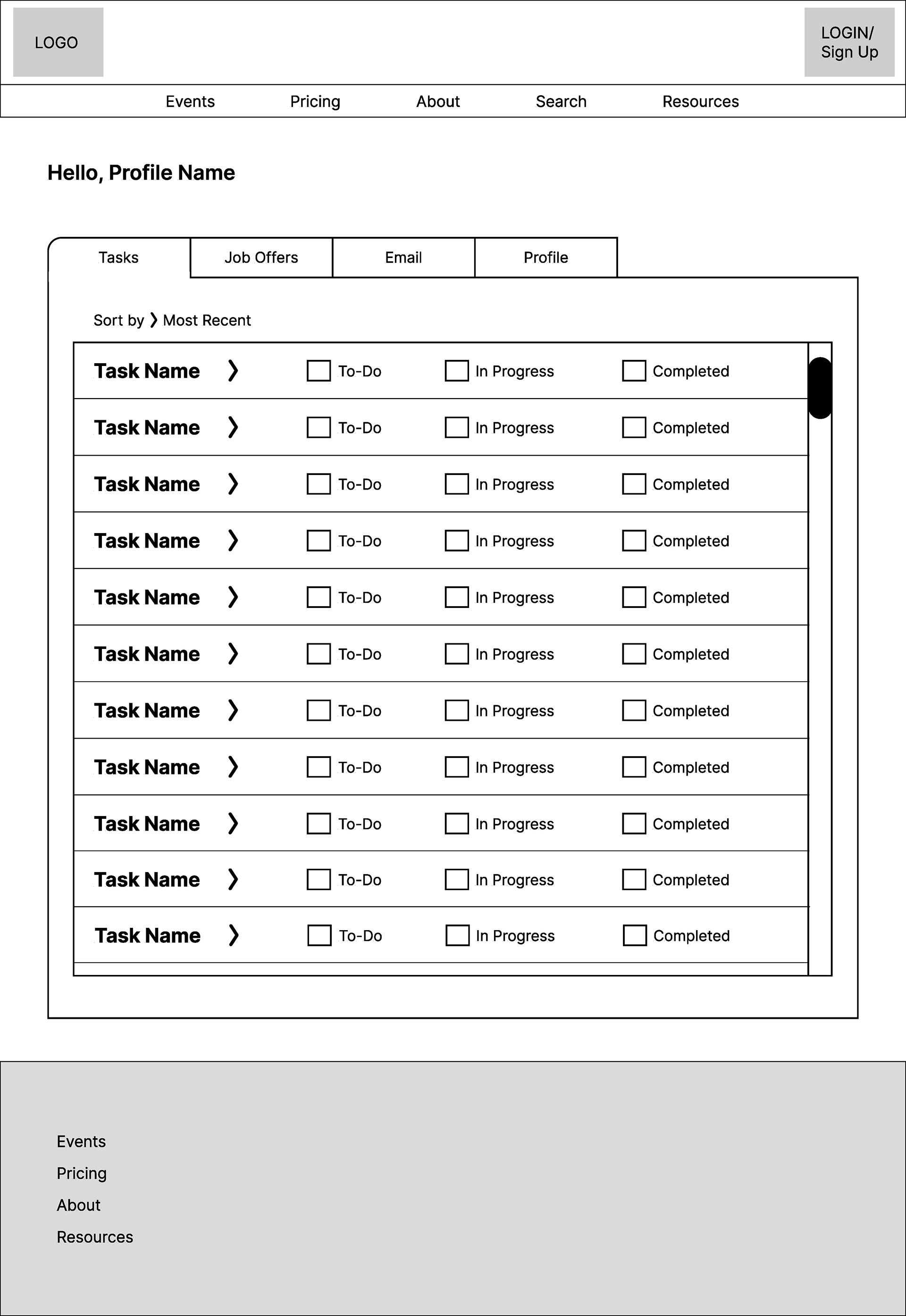
Task Category
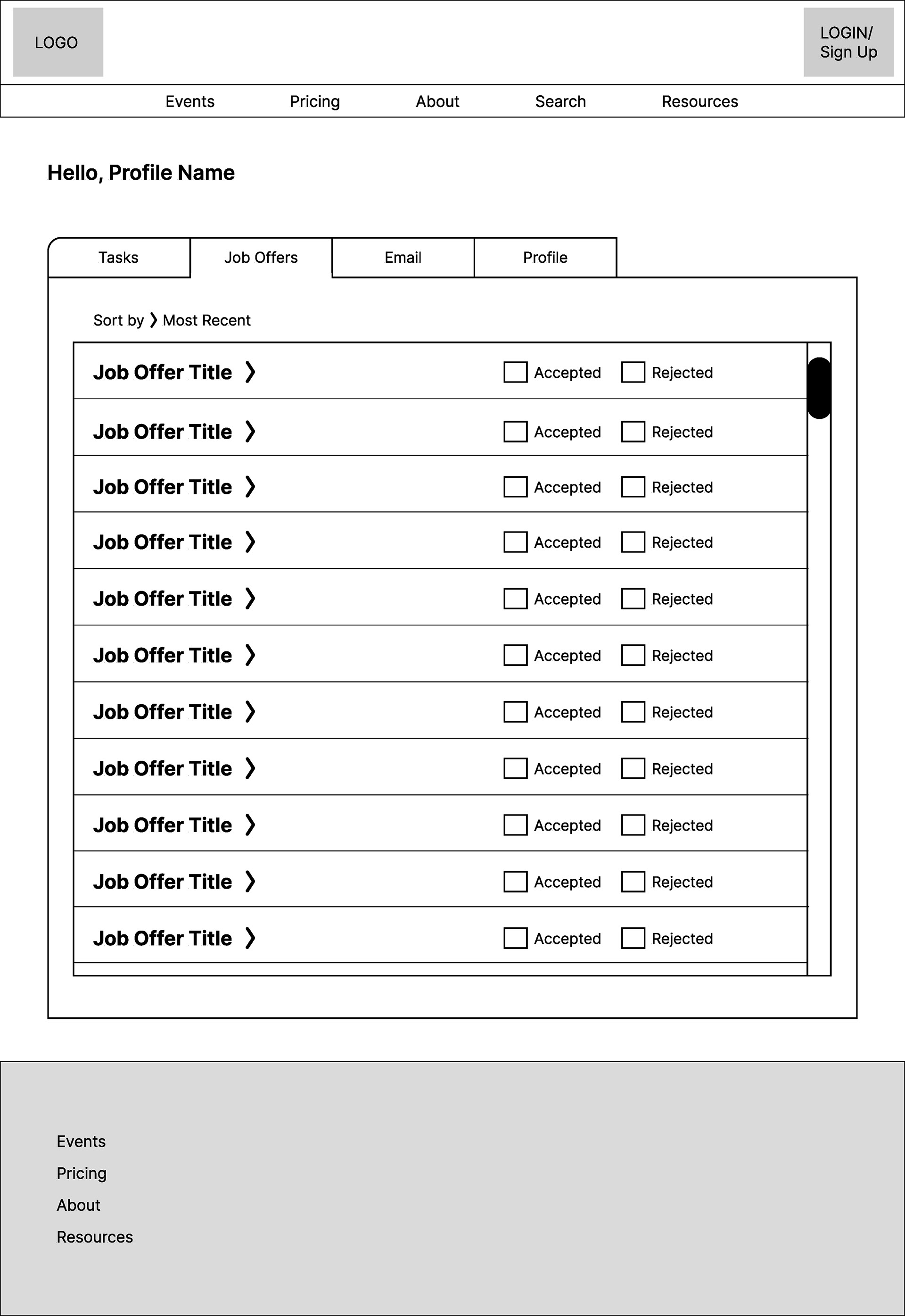
Job Offer Category
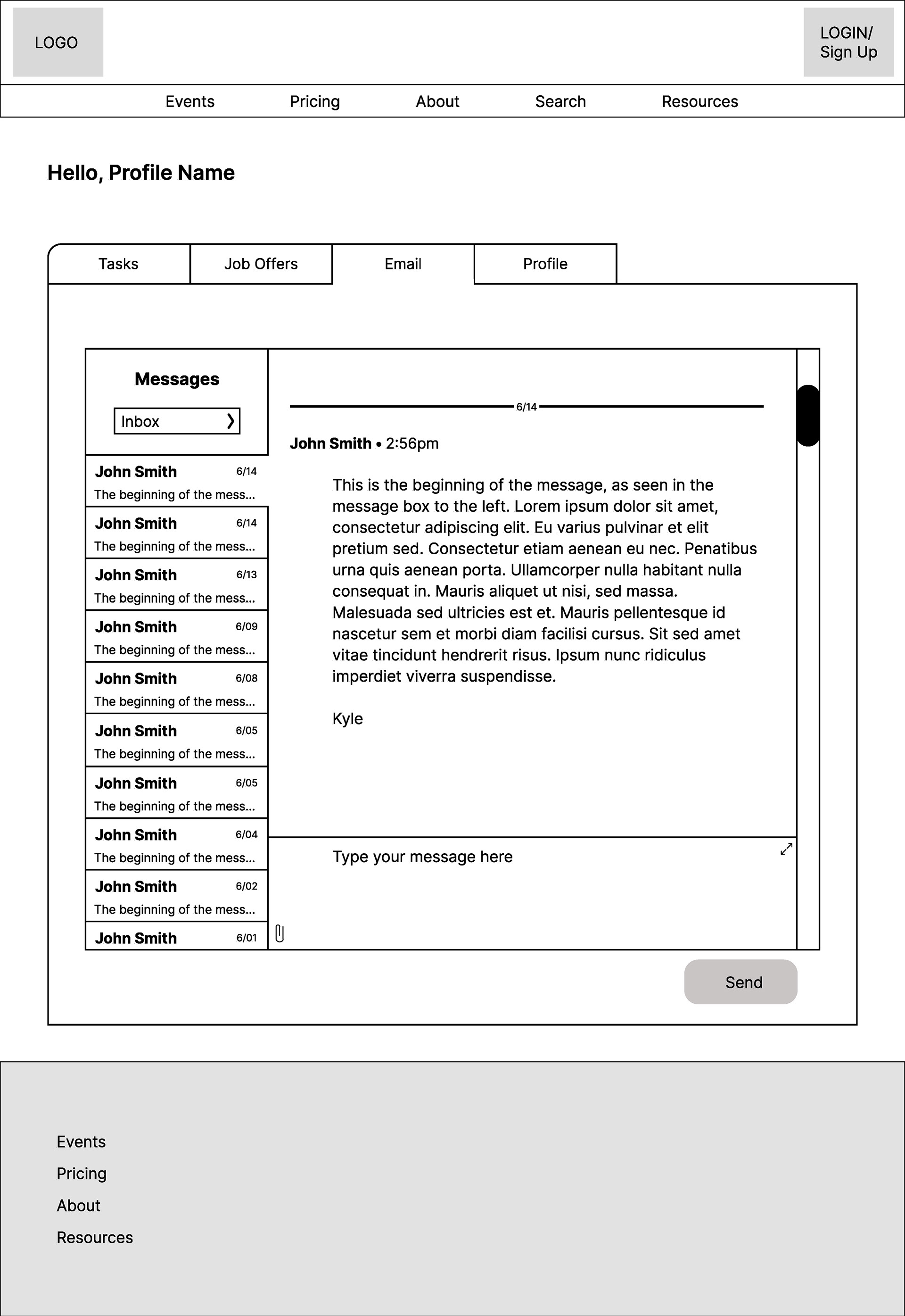
Email Category
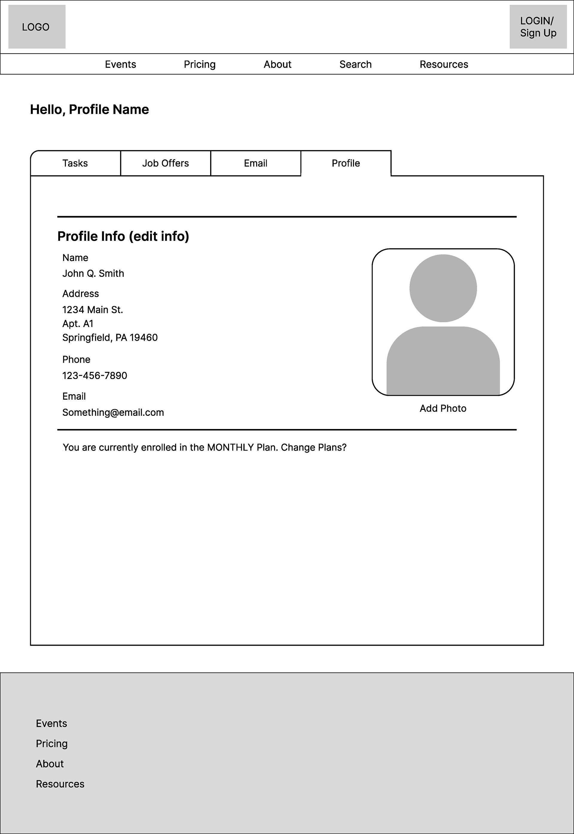
Profile Category
Pricing Page:
This is where the plans are presented highlighting what each plan has, the bottom of the page has a CTA for each option, all of which go to the same page, allowing users one last chance to change their plan.
Price Options Page:
Each CTA from the previous screen bring you here, where you will finally enter information to sign up for the account. The selection you chose will be selected on this screen, but it gives you the option to choose another one, my thoughts being to give the user one last chance to select another plan.
Resources Page:
Users can access content from here. Availability of content depends on the selected plan. All users have access to a base level of information, we had even discussed the idea of people who haven't signed up accessing a few select pieces of content but more would become available as you advanced through the tiers.


